Gallery
2020
GOOD DESIGN AWARD
TK Studio's Logo & Identity
TK Studio's Logo & Identity


分類タグ
Media & Contents
Companies
Business Owner
TNOP DESIGN
Award No.
20TH01390
Outline
"Sustainable" is the main concept of our design. In order to spark awareness among potential customers to be interested in preserving or improving the environment, we visualize the idea into the logo and identity that is modern, simple, stylish, and not too flashy-enabling access to TK Studio's target group.
* Text may be generated using the automatic translation service DeepL.
Points of design
- .
- .
- .
Producer
Tnop Wangsillapakun
Director
Tnop Wangsillapakun
Designer
Tnop Wangsillapakun, Kanin Sangsuksai, Grittiga Prasitsiriwongse, Sakunjan Jantawiwat, Tanachat Krongyuti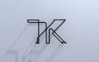
Launched
2019/12
Background
We took the concept of sustainability-reinterpret, design, and present it in the form of a looping logo. The concept is applied into the stationery set and website design, where the line graphics connect in loops, which reflects the system or mechanics that work in cycles. We use the foil-stamp and emboss technique on the papers to create the continuous flow of the looping graphics on even on the side that doesn't have line graphic printed onto. Also, the name cards are made with paper duplexing technique and has the contour line that continues from the name card onto the envelope, and onto the letterhead.
History and Achievements
We design the logo and identity for TK Studio, a landscape and architecture design studio that aims to put sustainability in design perspectives to design long lasting landscapes-enhancing the environmental friendliness and wholesome living. We present that with a continuous contour line that loops into infinity as the main identity to represent the sustainability concept. "Sustainable" is the main concept of our design. In order to spark awareness among potential customers to be interested in preserving or improving the environment, we visualize the idea into the logo and identity that is modern, simple, stylish, and not too flashy-enabling access to TK Studio's target group.
Specification
.
* The information provided is current at the time of the award and may differ from the information available today.
Jury's Evaluation
Jury members
村田 智明岡本 健藤城 成貴
Evaluation Comments
The structure of this logo representing the letters T and K drawn with a single stroke of a pen only becomes apparent when it becomes three-dimensional. We were impressed by the way in which this logo—something that only a design studio specializing in the three-dimensional could achieve—explores structural forms. With tools standardized in black, this clean, stylish design creates a positive impression.